This is part of a series called Enhancing your Course Homepage.
Your course has a default top navigation bar. Depending on the institution you are at, the bar might look different than mine, but the default configuration of your navigation bar might not be sufficient for your course.
When designing the experience for your students, verify that the tools and links in the top navigation bar (we call it "navbar" in the biz) are relevant. You are likely to find that you might want to prune some of the links from the navbar - or add new items.
From a usability standpoint, you should ask if the links are necessary (any information that is not relevant in your course should not remain). At FLCC, we have a link to "Discussions" in our navbar. But if I teach a course with no Discussions (or maybe just one or two), is there merit to having a link? Probably not.
PHILOSOPHY
The default links at my institution are a good start, but I suggest spending some time deliberately considering their relevance.
Course Home - I like to keep this link; students need a quick way to get to the course landing page. It's a great mechanism for students to anchor to. If they manage to get lost in your course, they can always click here and return to a place they are used to.
Content - I also keep this link because it's a quick way for students to reorient and jump to the heart of the class.
Assignments - I remove this link for two reasons. I know this is controversial, but the link can be misleading. The Assignments area only contains assignments created in Brightspace. If you are using third party software, those links will not appear in Assignments. If students rely on that link as the source of truth for all assignments, they are likely to miss other assignments. It also affords a short-circuit to the course flow. The first semester of using Brightspace in a fully-online, asynchronous course, a number of students were submitting work that indicated they had not fully explored the content in the course. As I talked to students it became clear that they were just going to the Assignments tab and doing the assignments. I have found that removing that link obviates that issue. Sure, students can still exclusively access the work in the course from other areas (Calendar, Work To Do), but this mitigates the issue pretty well. And since I talk about it in the course orientation module, this signals to the student the importance of exploring and engaging the course in an intentional way.
Discussions - I remove this link for the same reasons as the Assignments link; students should be participating in the conversations at appropriate opportunities in the course. A well-designed course will have students respond to the experiences they have freshly engaged in. When timing and scaffolding is critical, students should encounter the discussions at that point. This link is also vestigial in face-to-face courses.
Quizzes - I remove this link for the same reasons as the Assignments and Discussions link.
Roster - I remove this link because it is not germane to the way I design my courses. Our department at the college has a very robust Discord server for students and faculty. I find that using Discord engages students across sections, majors, and semesters. Students in each of my courses can find their peers in Discord (and the conversations are not ephemeral, participants can come into the conversation and leave it whenever they want, and others can enjoy the conversation) so there isn't really use for the Roster tool (that only emails to the internal mail system in Brightspace).
Grades - I keep a link to Grades. Students access this tab all the time.
Class Progress - This is a wonderful tool for students to leverage! Students can get a broad-strokes view of their performance in the course. I like to leave this one in the navbar.
Virtual Classroom - I don't use this tool, so I remove this link. If you don't use it, you should remove it too.
Course Tools - Although I use some of the links from this menu, I still remove the link. I much prefer adding the Course Admin link. I find the drop-down nature of the Course Tools menu cumbersome and I like having access to all the course tools from the Course Administration area - not the select tools from the drop-down. Don't forget that this link will also provide students with shortcuts to - among other things - Assignments and Quizzes (oddly enough, Discussions did not make the list) so if you are removing links to Assignments and Quizzes you should probably remove this link, too.
Video Assignment - I don't use this tool so I delete it.
HOW TO
Adding and removing links is not difficult - you should totally try it! You might want to explore adding links that are not part of the default configuration, too - just make sure that their implementation aligns with your course design or productivity. For instance, I add the Course Admin link since that increases my efficiency in the course (and students can't see that link).
The only frustrating part about modifying the navbar is the first step. At my institution, the default navbar cannot be edited by me so I have to make a new one (and the workflow is a bit wonky). But trust me - once you do this the first time, modifying the navbar in all your other classes will go quickly. And navbars transfer when copying your course (although your new course will still show the default navbar; it is up to you to configure the course to use your customized one).
STEP 1 - Choose "Manage All Course Navbars"
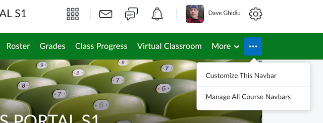
Navigate to the "meatball menu" on the top navbar (the "meatball menu" is the official name of the icon with three horizontal dots - vertical dots are called the "kebab menu" and horizontal lines are called the "hamburger button"). If you haven't modified the navbar in your course, you should choose "Manage All Course Navbars" because if you try to "Customize This Navbar" you will get an error message.
STEP 2 - Create a New Navbar
In Brightspace there are two ways to make a navbar - you can copy an existing one or you can make one from scratch. At my institution, I consistently get errors when trying to copy an existing default navbar, so I recommend just creating one from scratch. Click on the "Create Navbar" button. Note that if you do attempt to make a copy of a navbar you might encounter an error that says the navbar could not be copied. At that point, refresh your page because you'll note that you have created a navbar (but none of the links are in it).
STEP 3 - Customize the New Navbar
You should be able to click on your new navbar (any navbar that you create is clickable, any default navbar is not). Click on the navbar and make some changes.
Name - For the name, I recommend something short and meaningful. I usually prepend my initials in the name so that I (and anyone who inherits my course) know that it was custom made. The name I use is usually "DRG - Course Nav", but use whatever you'd like that is easy to parse.
Description - I typically skip the "Add a description" portion as it is not worth my time; I don't ever rely on the description when choosing navbars. If you have multiple navbars that you use in one course and can't articulate the intention of each in the name, then it might be worthwhile to use this field.
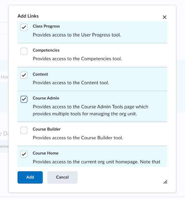
Links - Here's where the intentional design kicks in. Really interrogate which links are necessary. Add only the ones you think students will be using frequently or are important to the navigation of the course. All you need to do is click on "Add Links" and put checks in front of the items you want to be in the navbar. I like to check all the items I want and then hit the "Add" button. This will add the links in alphabetical order and you can move them after by dragging them where you want them.
Theme - At my institution there are two themes - SUNY and FLCC. I always opt for the FLCC one.
While you are at it, you might want to consider changing the title in the navbar, too. This understated option is really slick and I recommend you check it out. If you expand this section and select "Custom", whatever text you write in the field will replace the text at the absolute top of the screen. In this example, the text "23SU COMPUTING SCIENCES PORTAL S1" will be replaced with "CS Portal" (which is a much friendlier name).
When you are done with all your configurations (don't worry - you can always edit this navbar later), click on "Save and Close". At this point you have successfully created your own navbar! But you need to tell Brightspace to use it (remember, there are multiple navbars in your course).
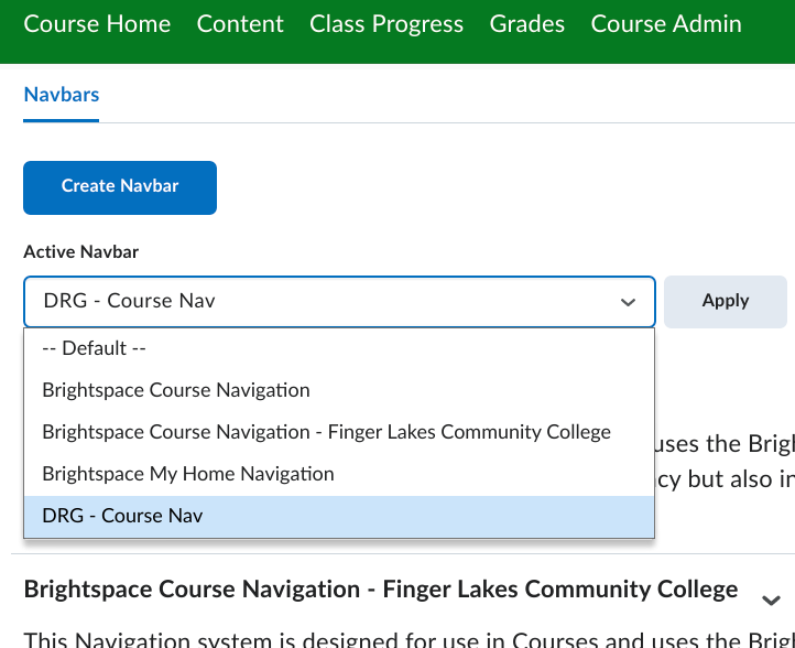
In the drop-down for "Active Navbar", search for the one you made (this is why prepending your initials is a good idea), select it, and then hit "Apply".
That's it! You're all set! Remember that when you copy your course over to another course your navbars will transfer as well. But it might be the case that the new course defaults to using a different navbar so you'll have to go into the course and change the "Active Navbar".
DISCLAIMER
There are multiple ways to do things in Brightspace; you very well might encounter faster or better ways - that's okay! For example, instead of clicking on the "meatball menu" you can also go into Course Admin and then click on "Navigation & Themes" to access the navbar. Or your institution's configuration of Brightspace might enable you to copy one of the pre-fab navbars. Find a system that works for you and use it!
My preference for specific tools and links is just that - a preference. You might find that having the Assignments link is beneficial in your class (I think for my face-to-face ones I might use it, for instance).


